MY ROLE: Principal Product Designer & Mobile Security Design Team Lead
RESPONSIBILITIES: Product strategy, executing end-to-end architecture, research, feature discovery, wireframes, prototypes, testing, visual design, style guide & pattern creation, spec documentation, engineering delivery & QA.
PRODUCT TYPE: Cyber Safety (all-in-one device, online privacy, and identity protection) :: Invision Prototype (View in Google Play & App Store)
TIMELINE: January 2019 – March 2020
Overview
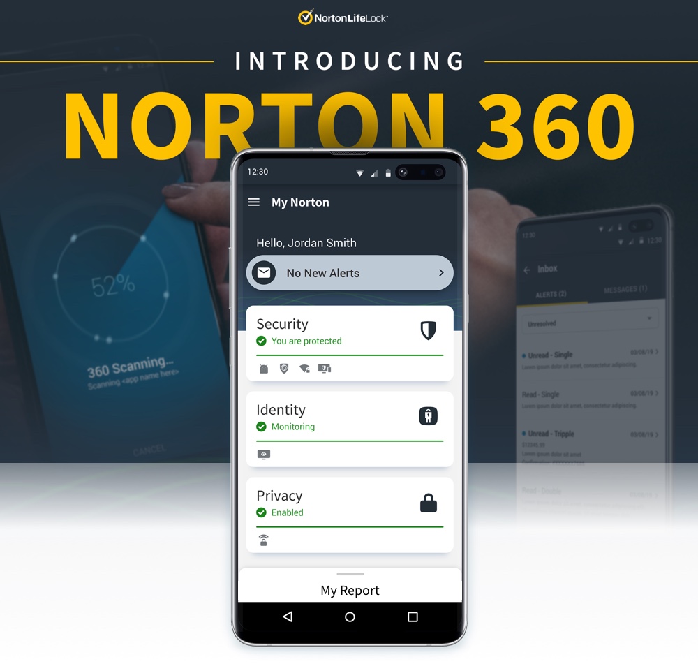
Norton has grown to a sizable user base with millions of customers looking for a solution to their cyber safety needs. The company added many more customers once the acquisition of LifeLock, an identity theft protection solution, occurred—this opened the door to create a solution that incorporated all of the company’s offerings in one place.
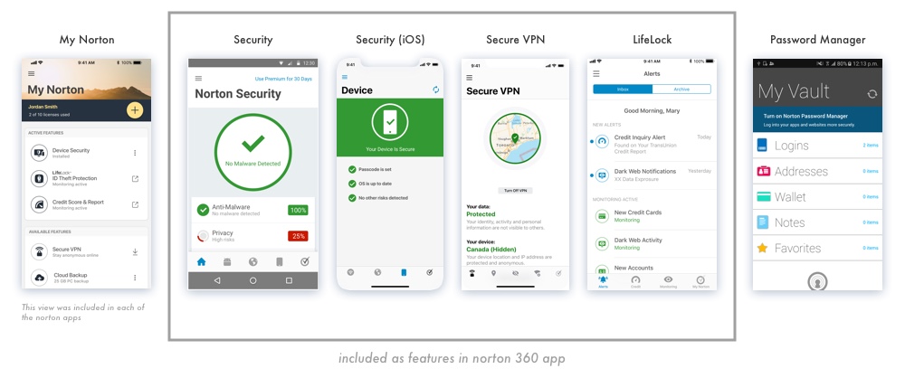
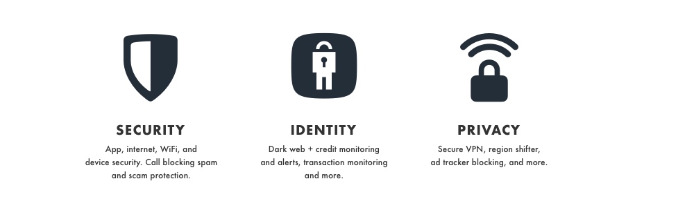
In late 2018, Norton began shipping a cyber safety experience in its products that had a consolidated view of all available features that a user had in their subscription. This experience surfaced everything in a way so that users could see exactly what they had and its status, but it did not have integration of these core features in one app. In 2019-2020, I and other stakeholders set out to create an app that delivers our core features of device security, identity theft protection, and VPN privacy in one place. This is Norton 360…
MY PROCESS
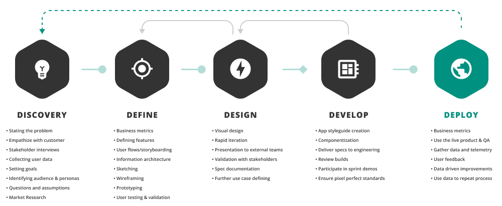
Discovery
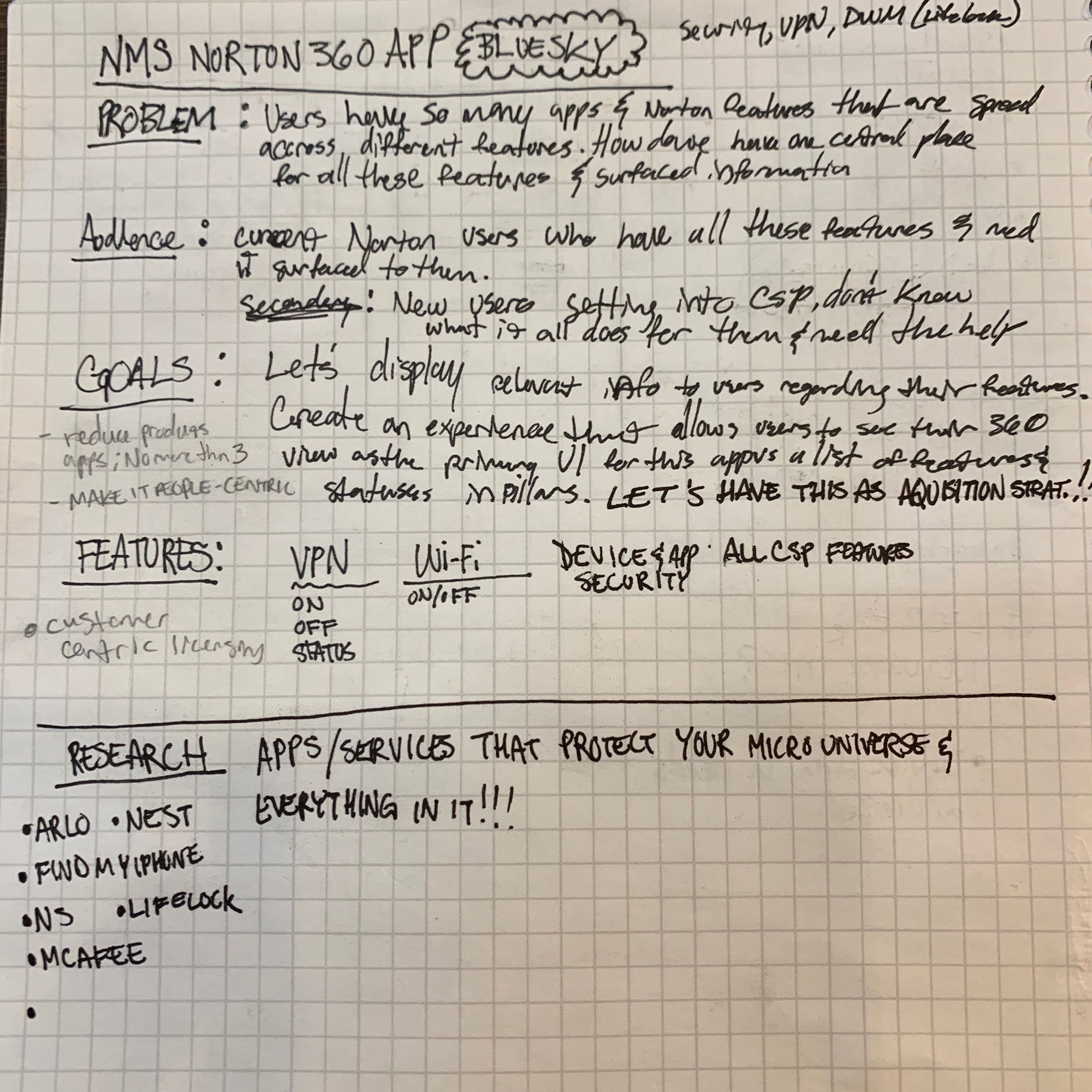
Problem
Norton users became acquainted with the aforementioned cyber safety offering UIs where all of their subscription features could be launched to their respective apps and browser experiences. However, users had confusion regarding which Norton app to download initially in order to utilize the primary features of the subscription. The Norton customer base provided feedback about not wanting to download multiple apps to get the full value of their subscription. It became clear that I had to address the issue of multiple apps having competing alerts with very differently styled experiences.
As for the design problem from a UX perspective, we had discrepancies between our iOS and Android security app along. I also had to address the different architectures, styles, and features of each app to determine how and what could be integrated. Additionally, we needed a better UX to drive emotion with customers and allow them to have a streamlined experience with their subscription.
PREVIOUS CORE-APPS
Goals
- Deliver a comprehensive cyber safety solution app that effectively incorporates the core security, identity, and privacy features.
- Improve and streamline architecture/experiences for each feature category in the app.
- Drive acquisition of new Norton customers through mobile channel.
Research
Collecting various apps that immediately come to mind in terms of being a direct competitor as well as ones that have experiences that combine multiple features and views was a key starting point. It was important to understand the reasoning behind how all of these apps behave and how I could simplify our own experience at the same time.
- Dashlane
- McAfee
- Mint
- Credit Karma
- Google home
- Arlo
- Ring
- Turbo
- Chase/Citi/Discover apps
Knowing The Customer
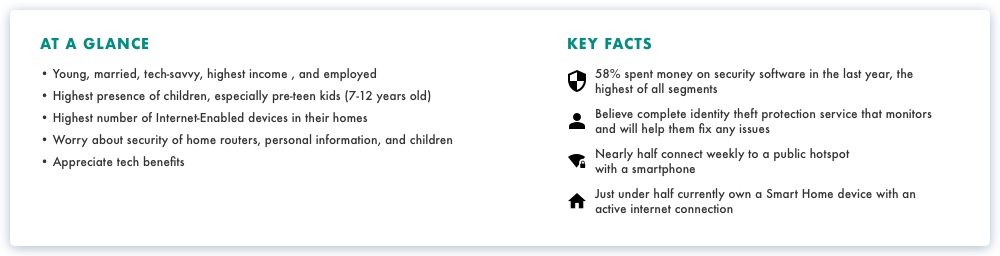
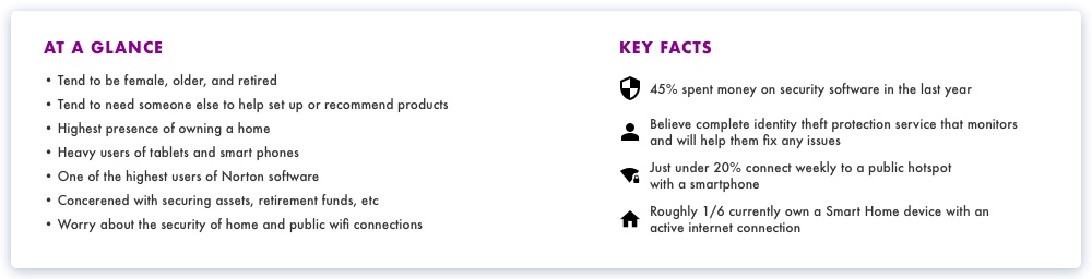
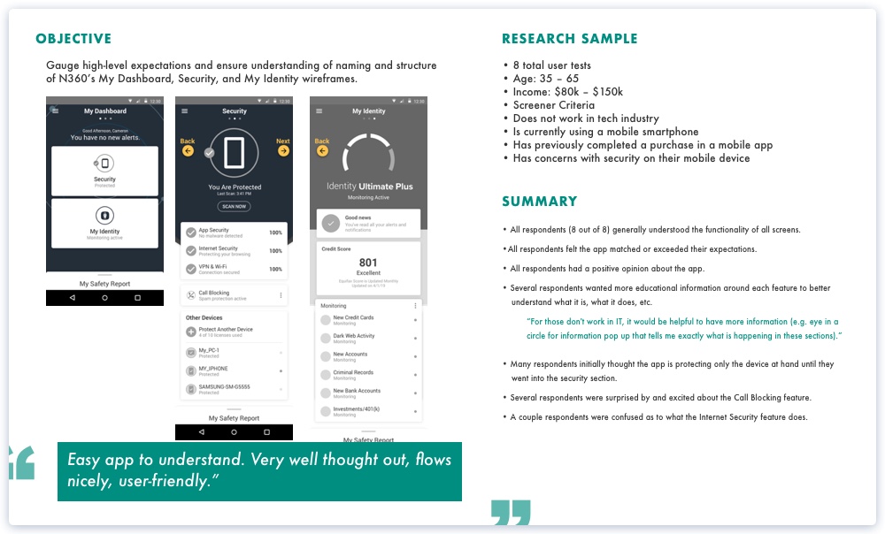
CUSTOMER RESEARCH HIGHLIGHTS
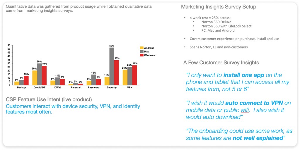
I worked with product managers and marketing insights teams to gather data on how customers used CSP, what they thought about the experience, and our general types of customers.
Audience
PRIMARY
Current Norton customers with a comprehensive cyber safety subscription.
SECONDARY
- New customers acquired through the mobile app and play stores.
- Customers who purchased in e-store or retail
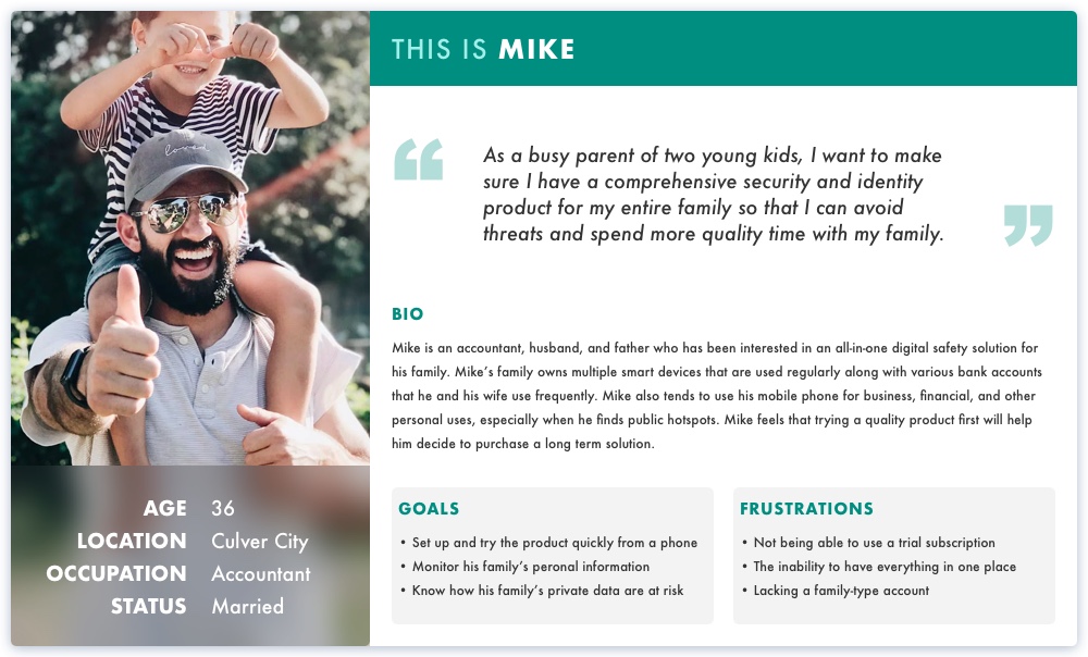
The People
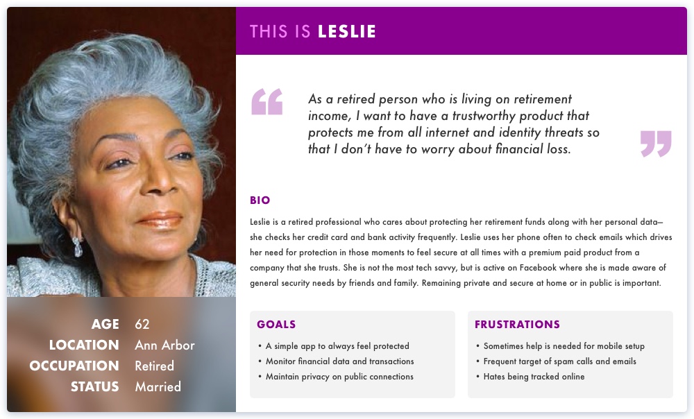
The Norton product line mostly breaks down into two main set of users: the proactive protectors and the safety-seeking delegators.
PROACTIVE PROTECTORS
SAFETY-SEEKING DELEGATORS
Define
From the beginning, I worked cross-functionally with our product manager and engineering architect in multiple stakeholder meetings to streamline our feature-set. This helped create a better architecture and story for customers while integrating the VPN and identity apps.
FEATURE DEFINING
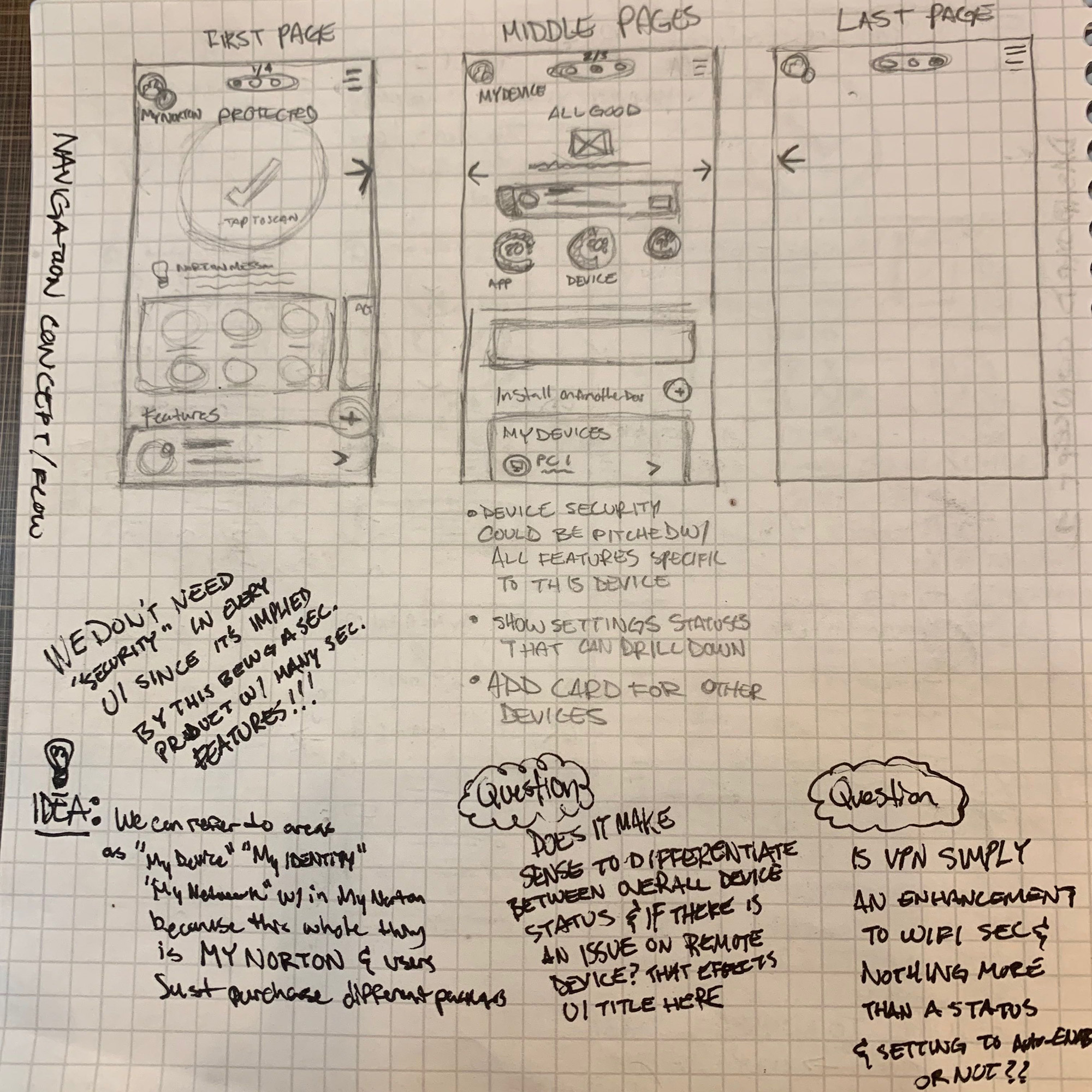
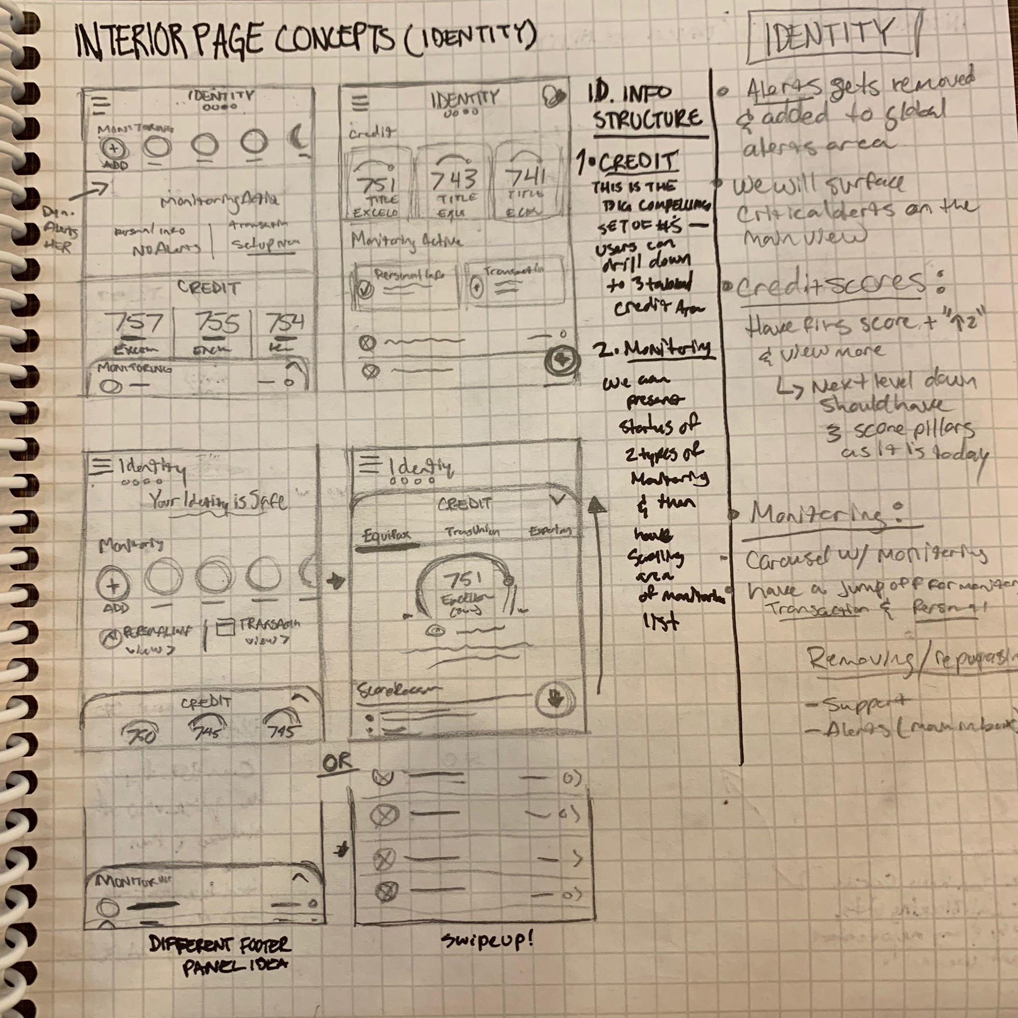
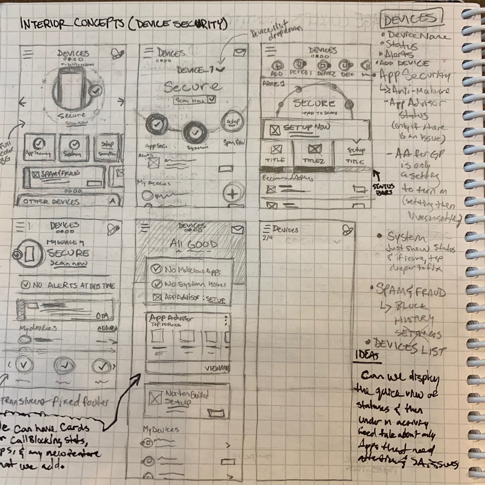
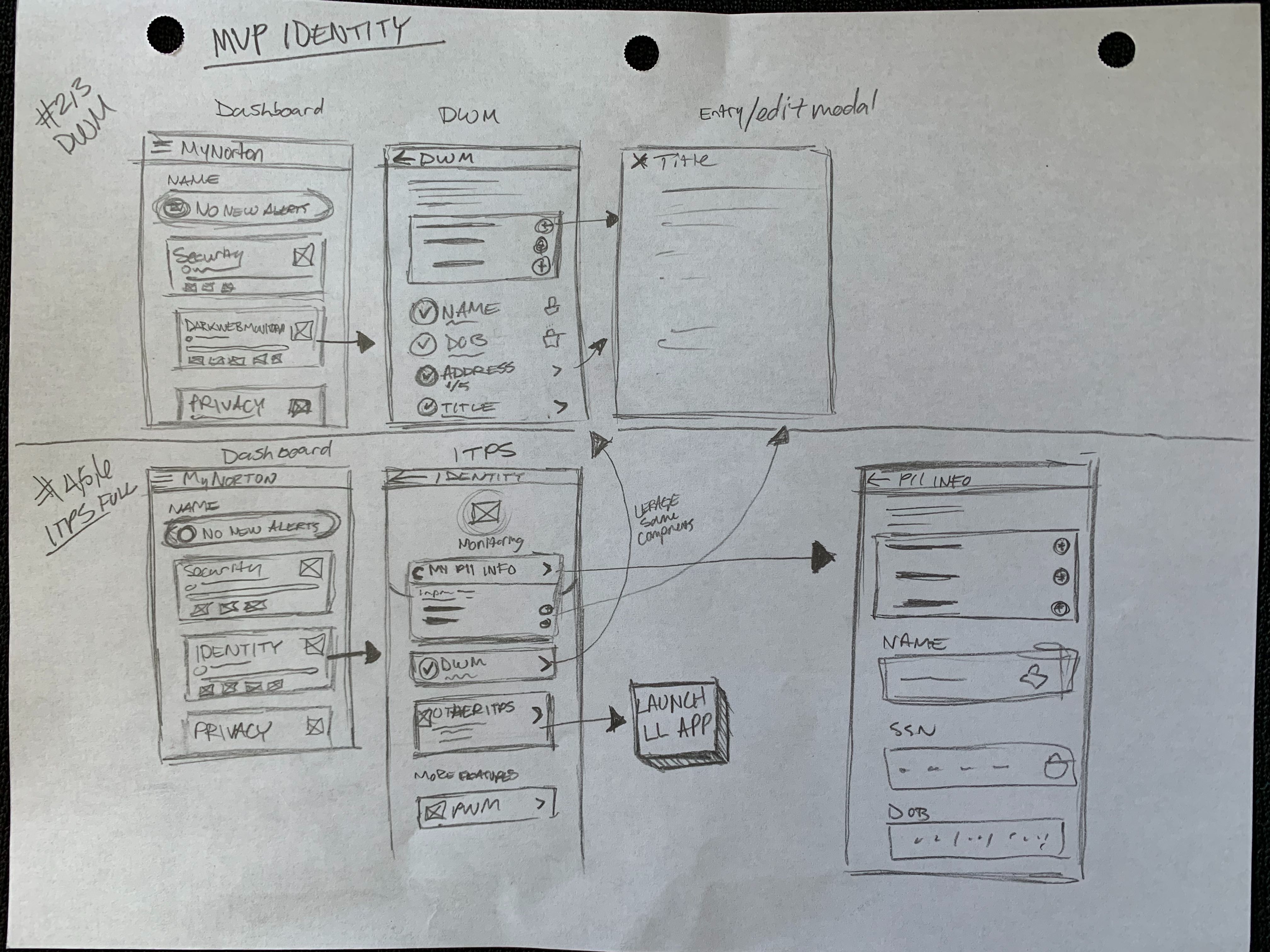
This involved evaluating what we had, renaming, consolidating similar features, and removing unnecessary ones.After I streamlined the security app, I focused on how to streamline and integrate the VPN privacy and identity app features while mapping out new structures for their presentation within this app.
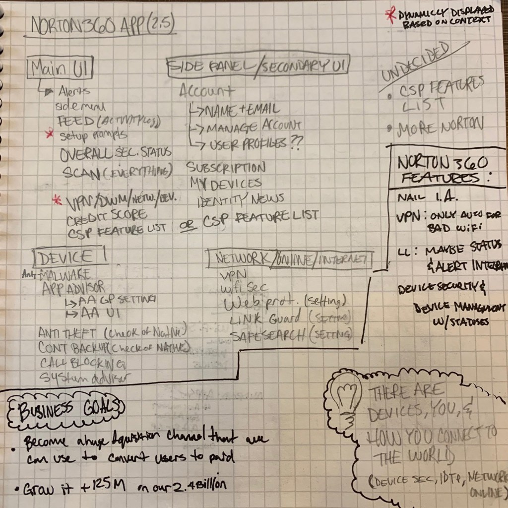
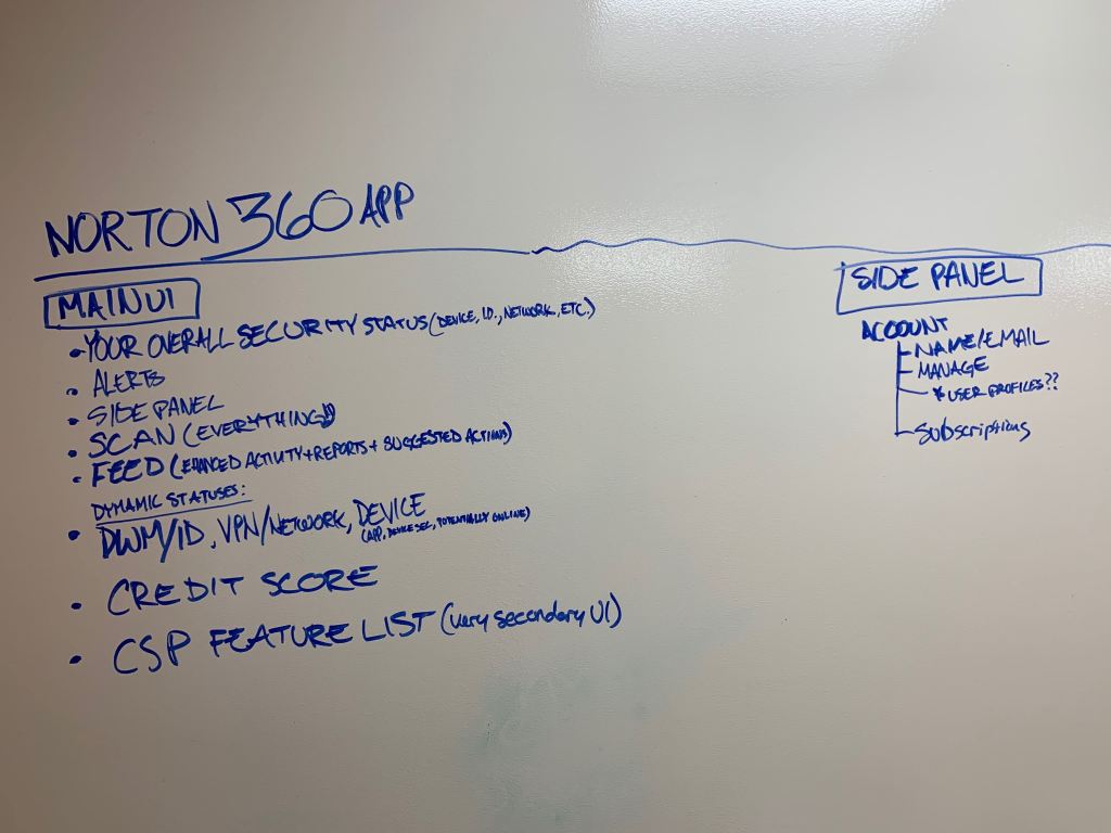
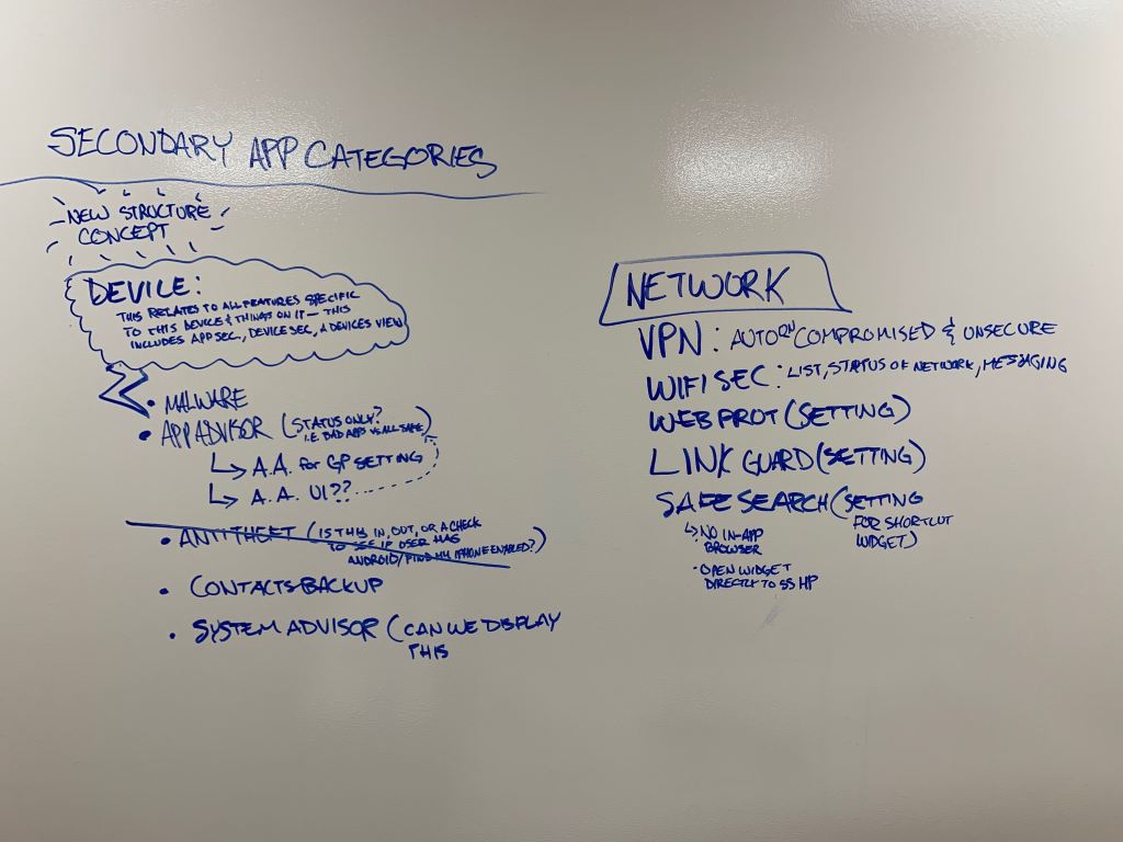
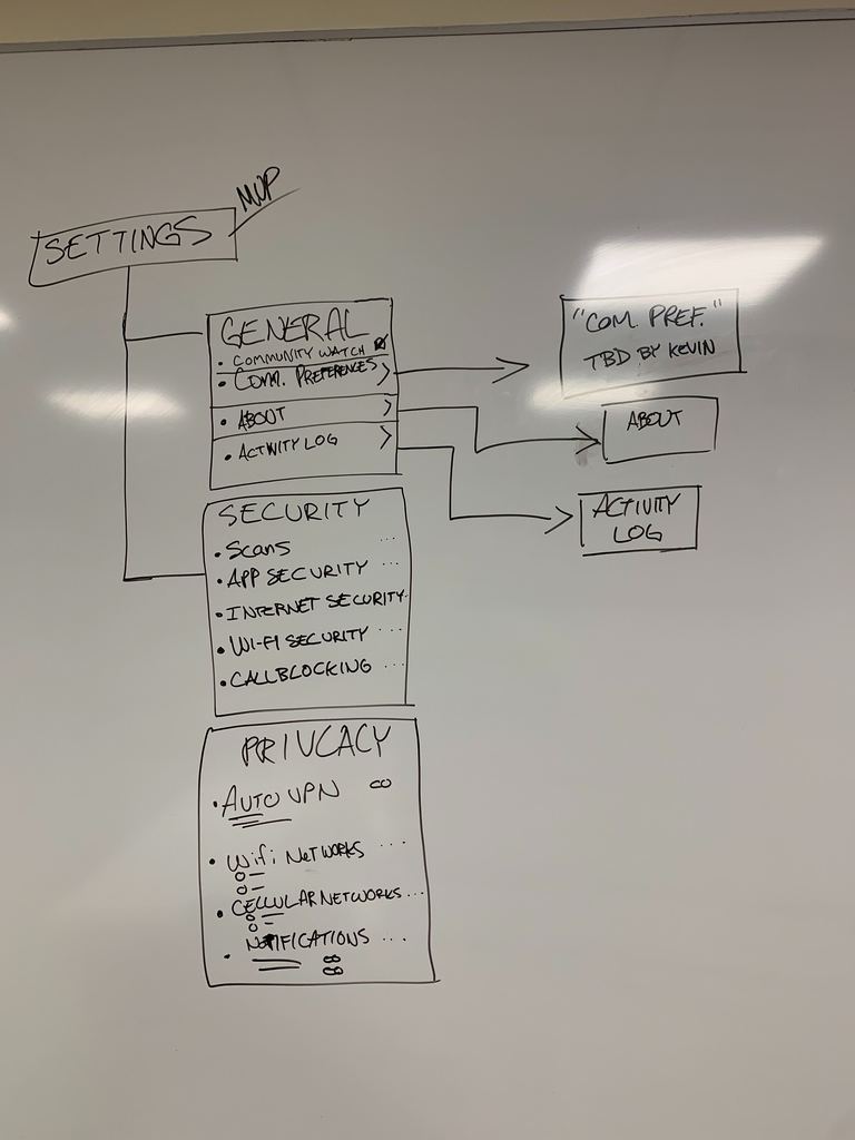
Information Architecture
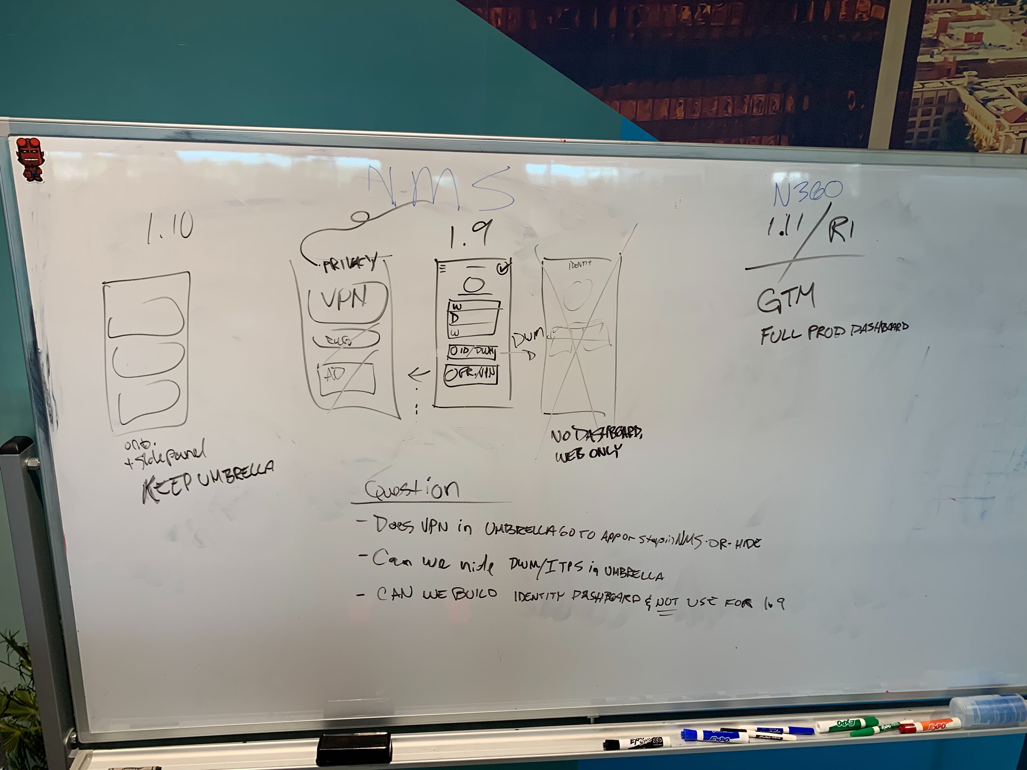
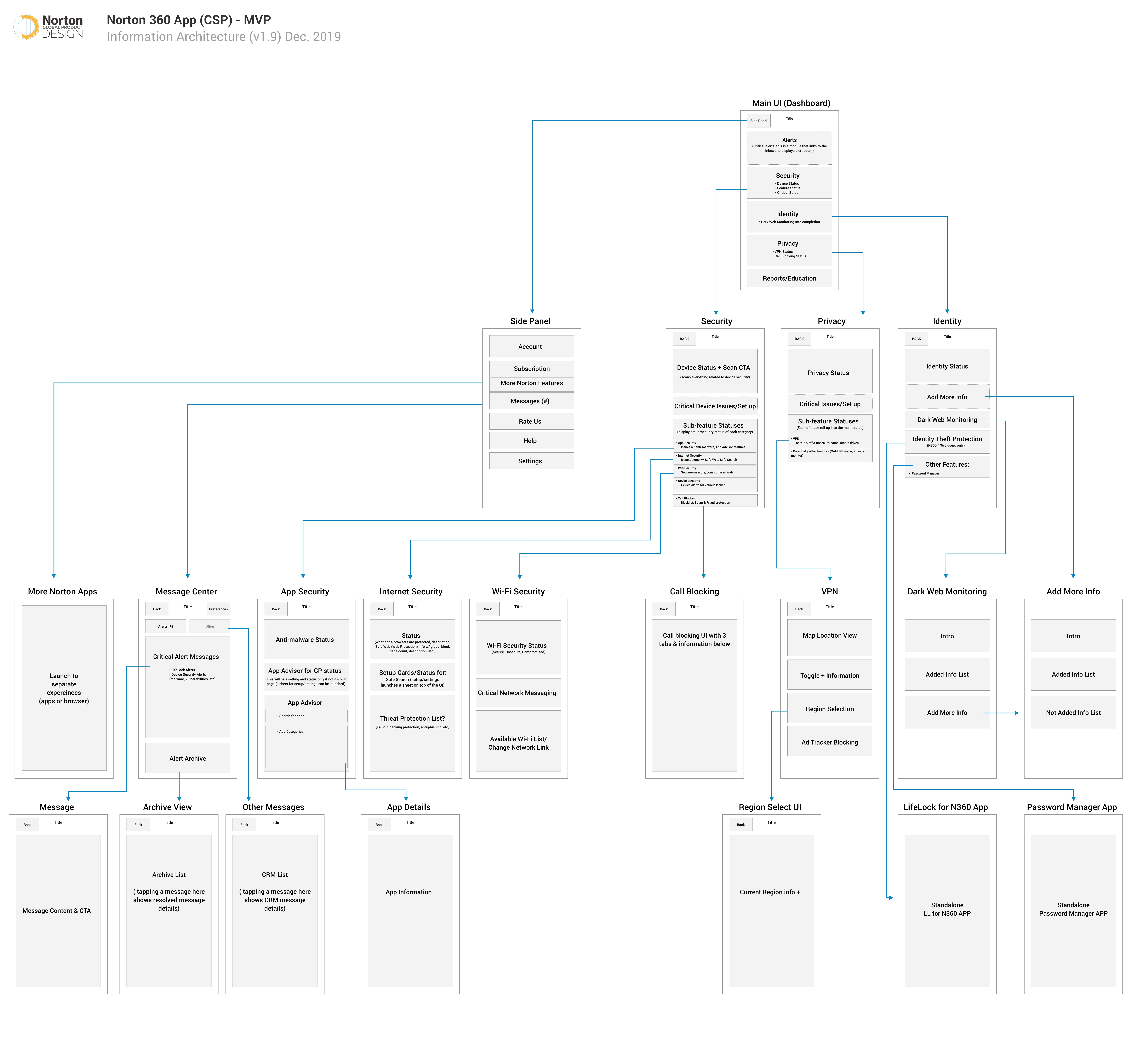
Creating white board drawings to organize the features and structure the information is key. Figuring out how to present the information in appropriate areas while ensuring users find clarity in the massive ocean of information is always a challenge and it can be made easier by blocking out the architecture with the raw details. I presented the information architecture to stakeholders throughout the company—from senior VP engineering leaders to fellow designers and product managers, I had to ensure that the integrity of the app was solid for this undertaking.
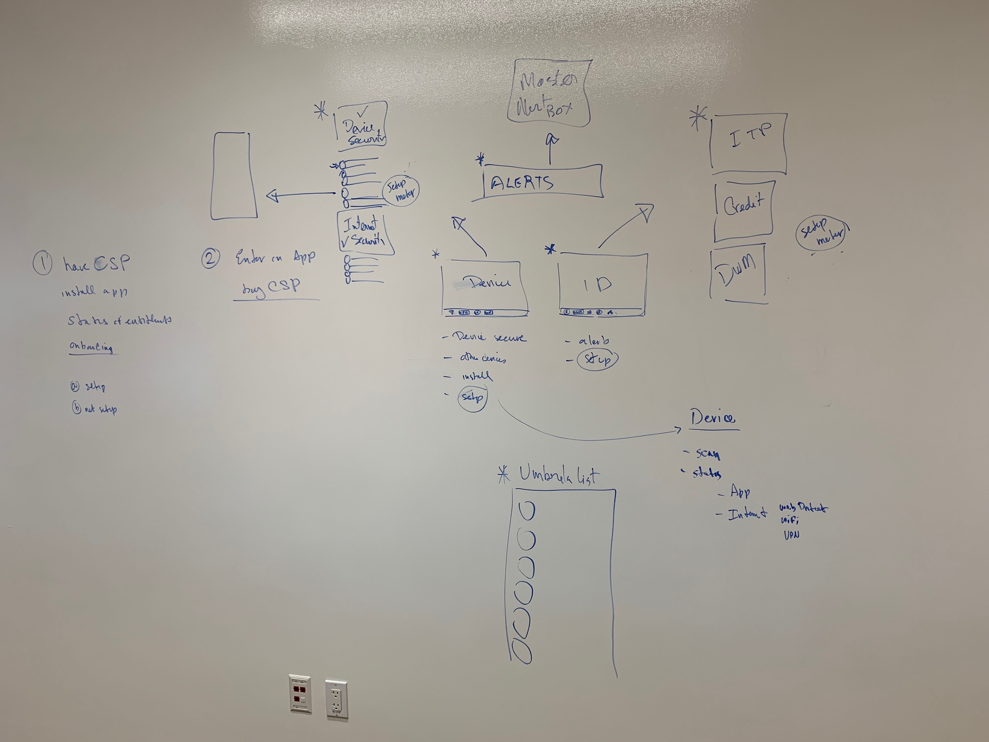
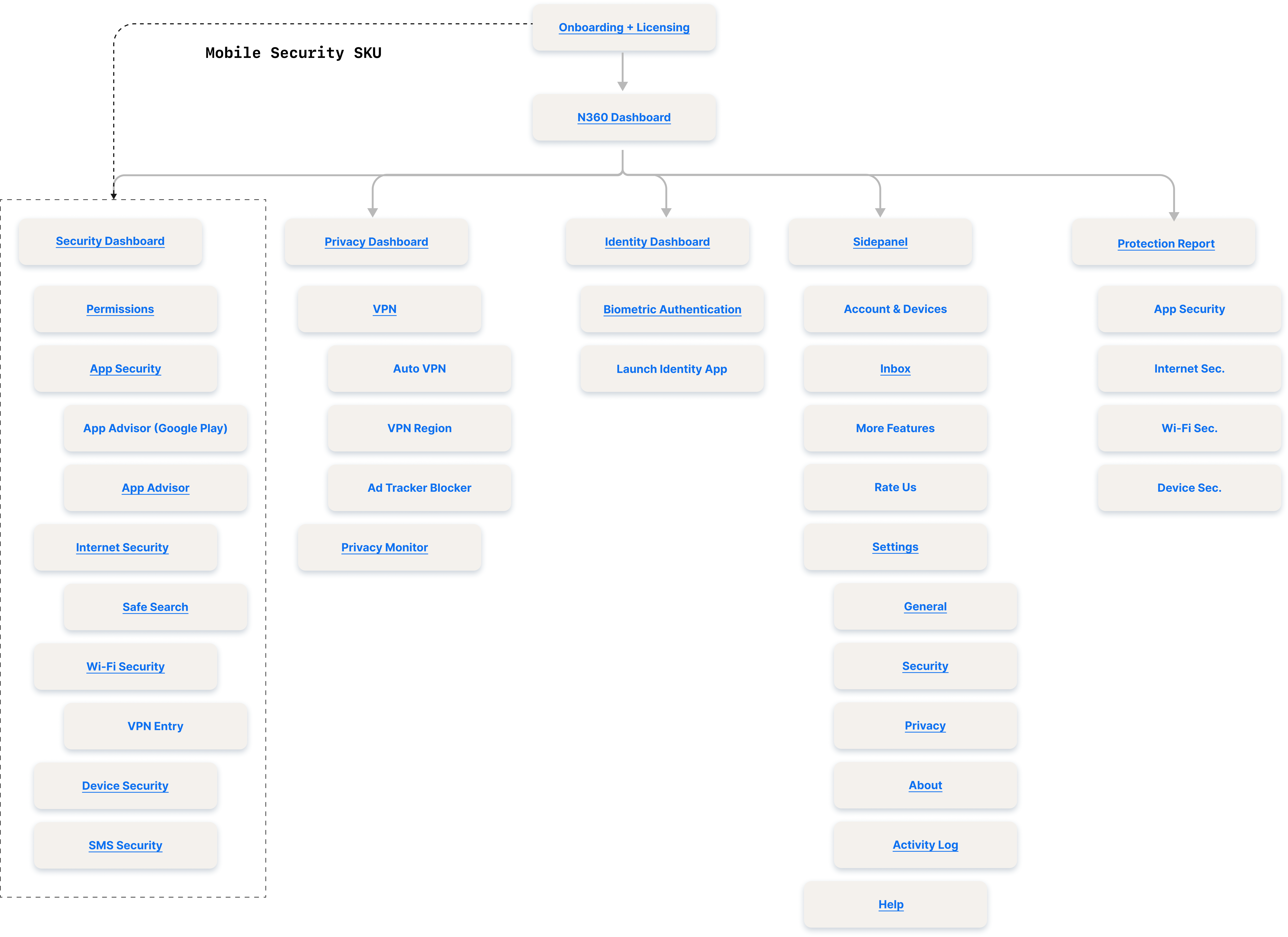
IA Blockframe
User Flow
A challenge with combining such robust features was the fact that each area requires setup for the respective features. It was important to map this out and not front load these in onboarding to allow users to get into the app faster.

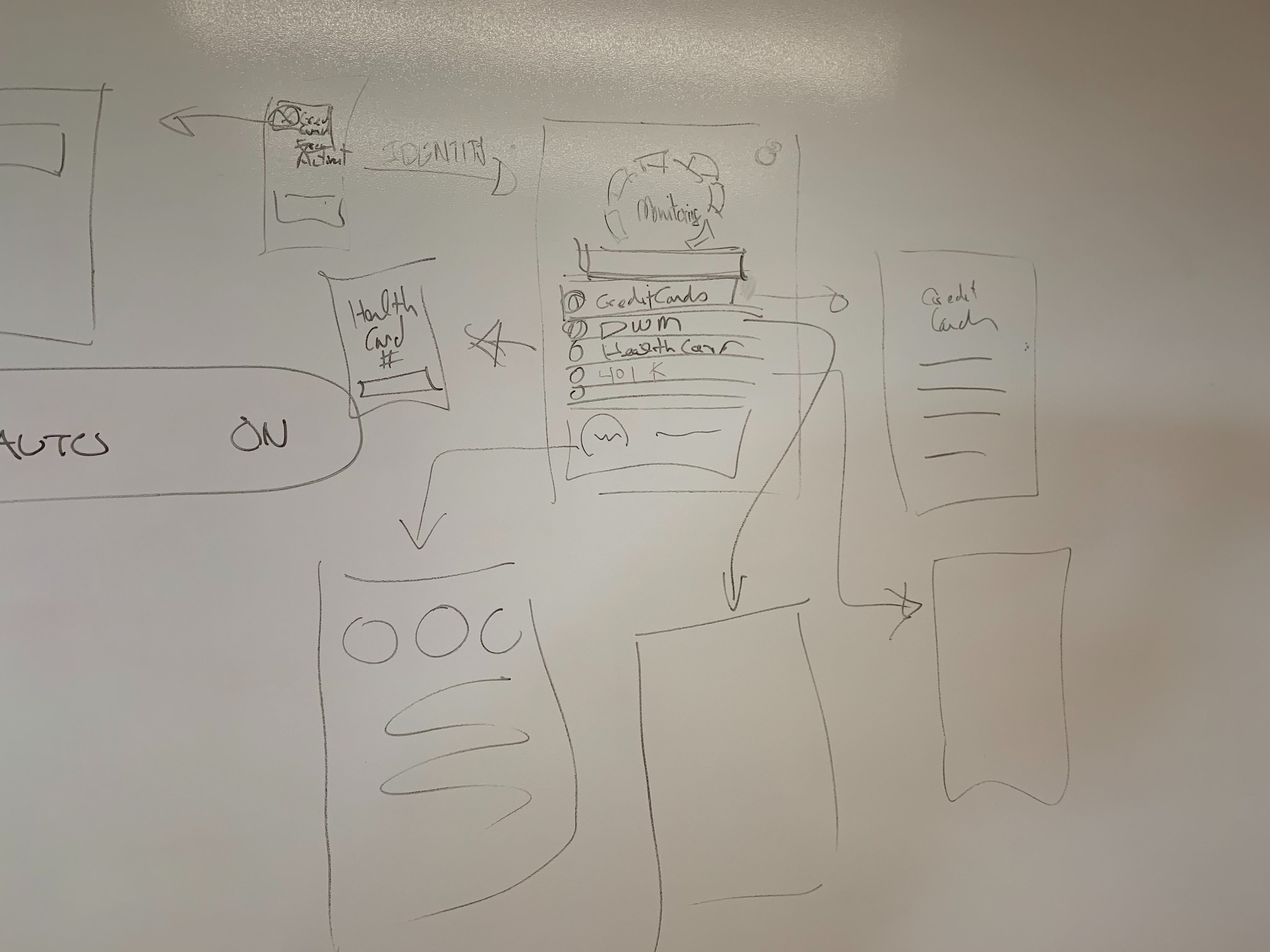
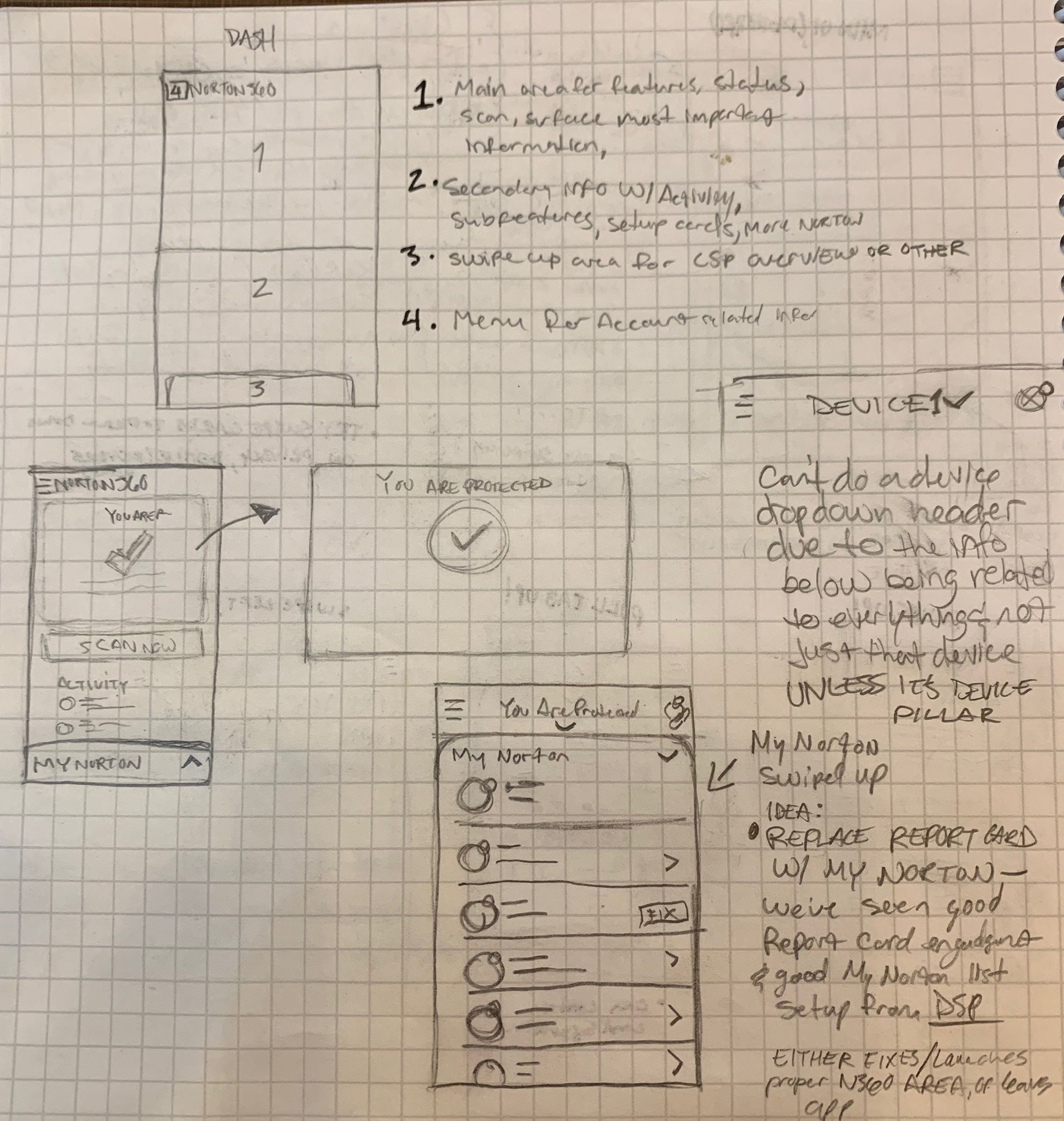
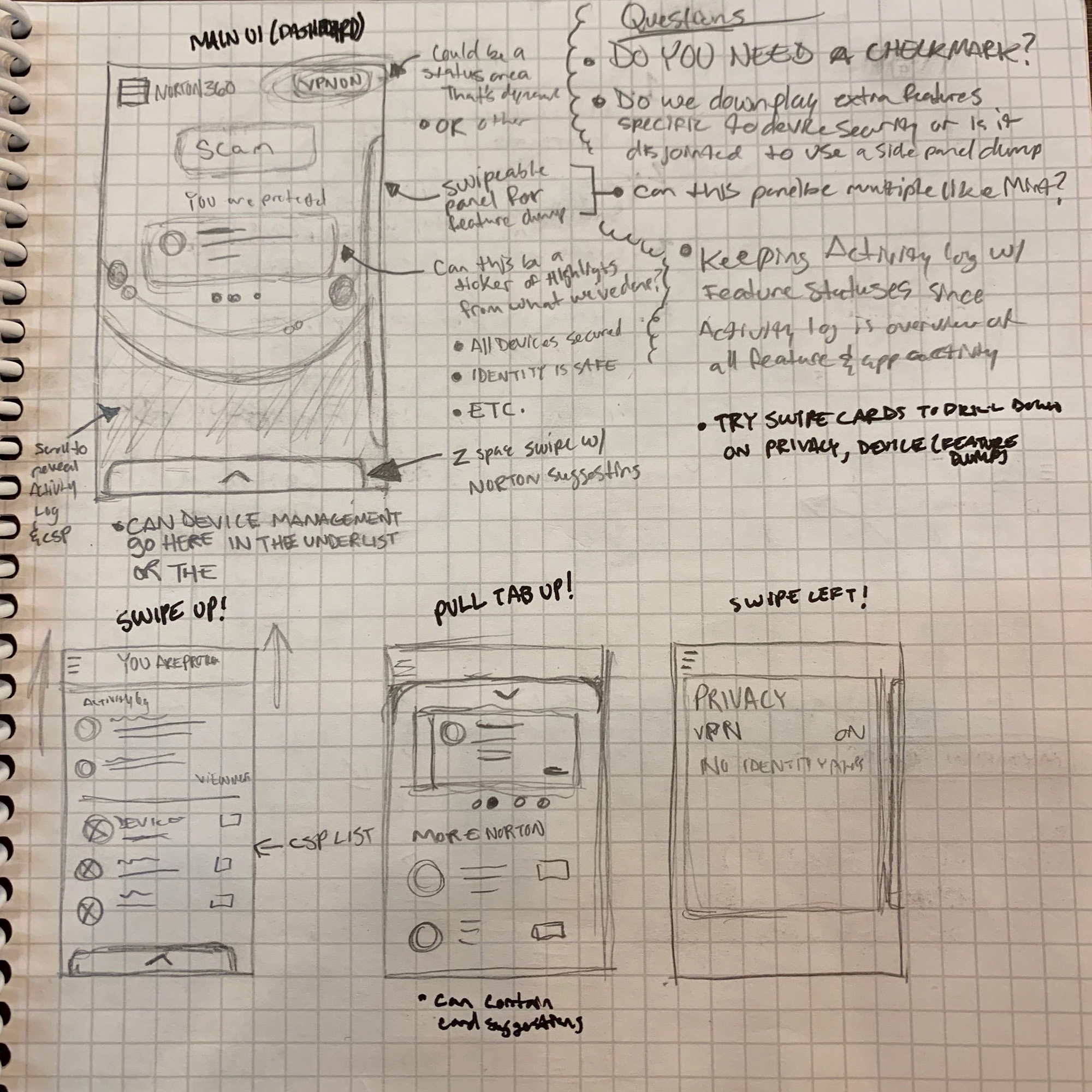
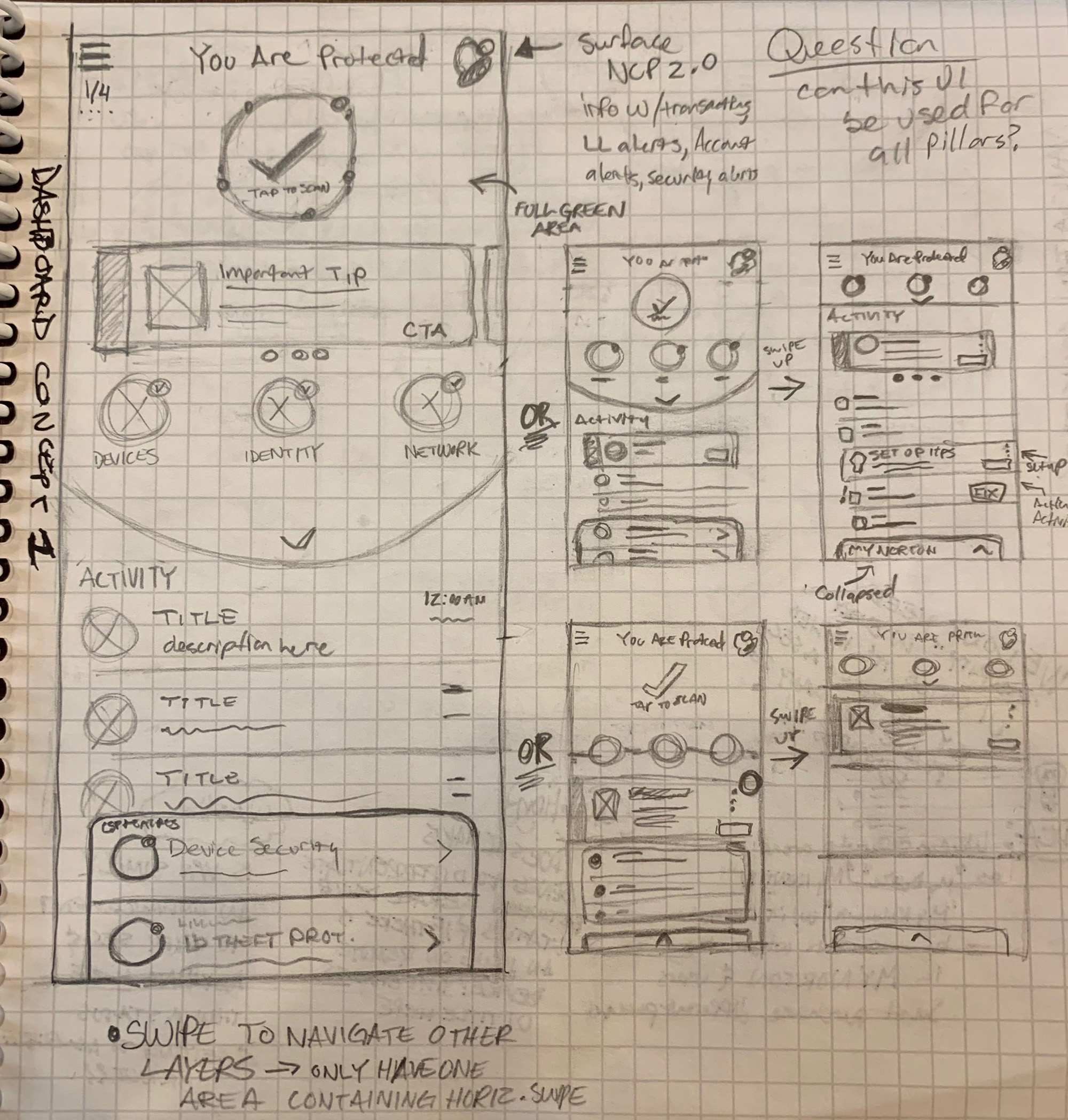
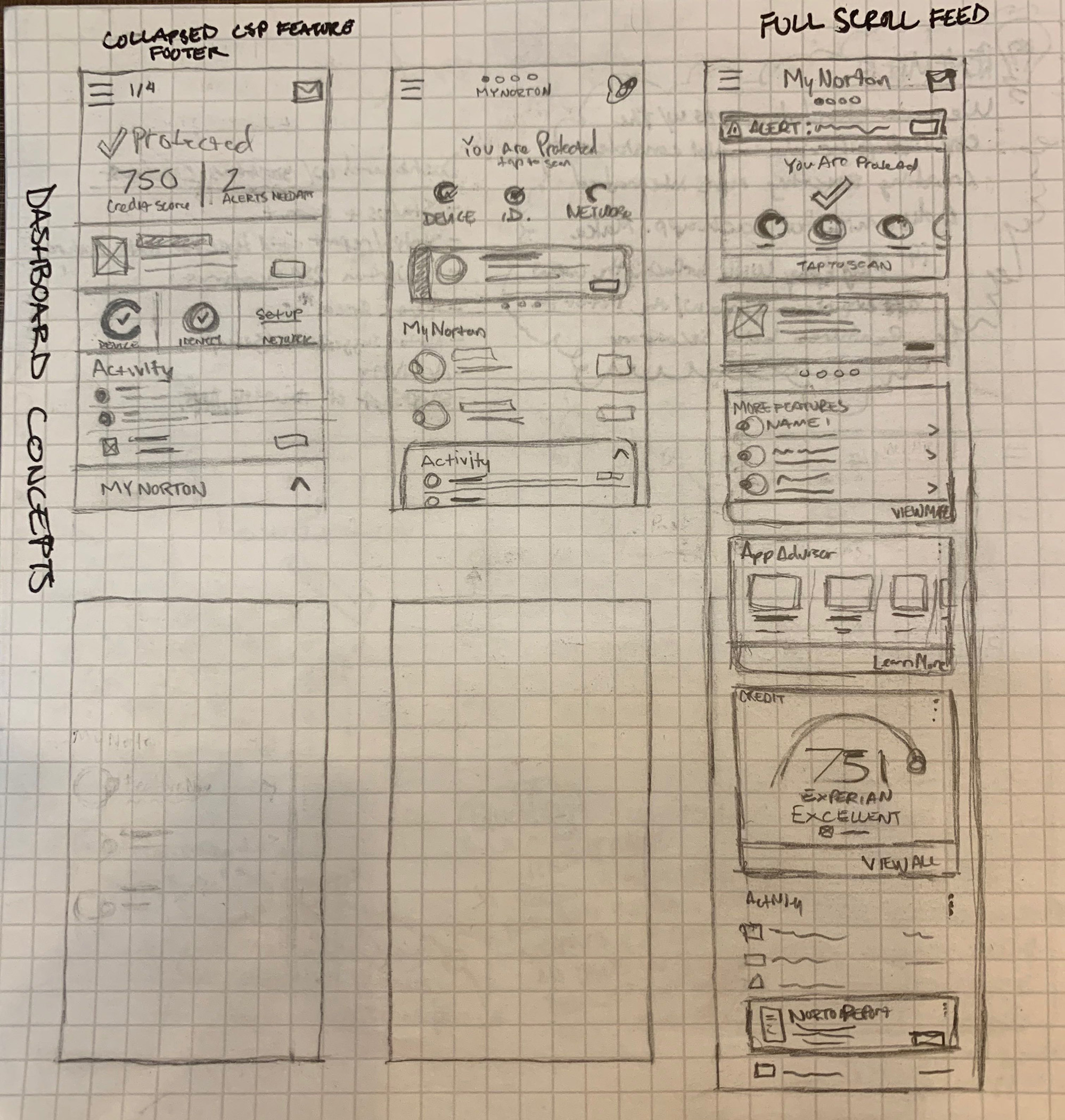
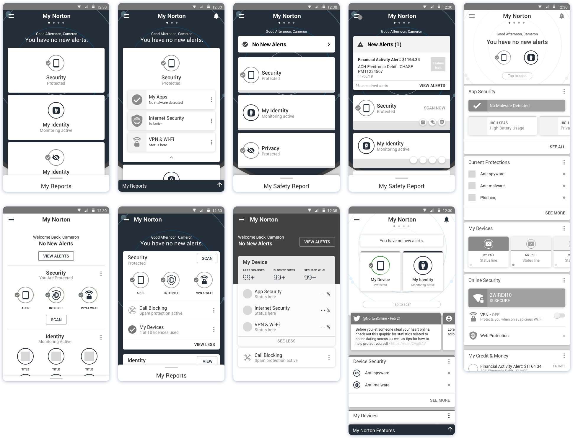
Sketching
The interaction model, main UI dashboard, feature dashboard UIs, and more were considered in this phase. Iterating quickly through sketching helps organize all of the raw information that was distilled in the earlier phases.
Wireframes
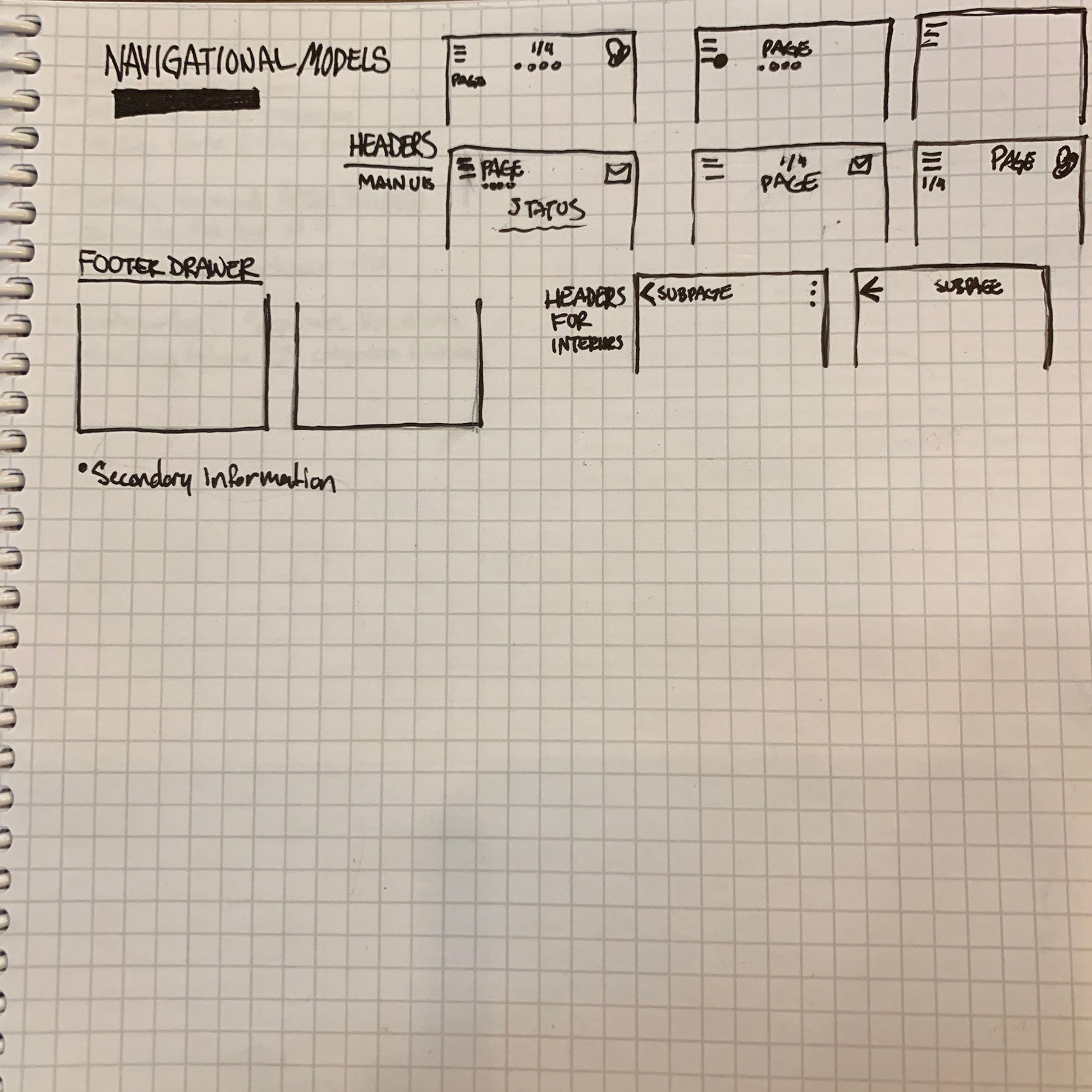
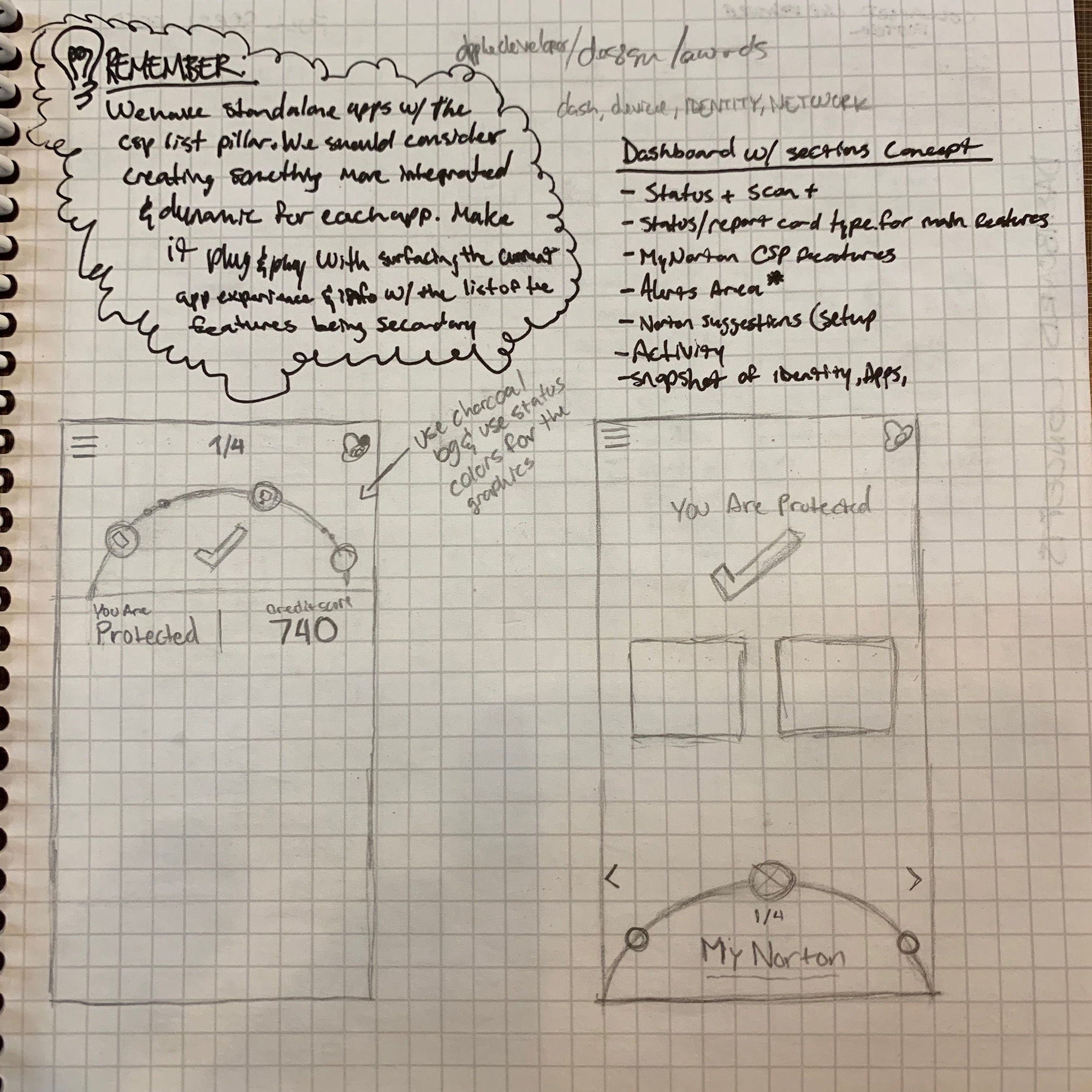
Modularity was a big focus in this phase—I wanted to ensure this app can shrink and grow as needed to adjust for all variants that customers may have on their device. I also moved the app away from a bottom navigation bar in order to have more flexibility with where the app can go in terms of feature scaling. In this phase, I explored a swipe UI (like credit karma) along with a more tradition navigation that allowed users to focus more on the area that they are in.
IDEATION
USER TESTING & VALIDATION
After crafting a direction that I got buy-in on, I worked with our researchers to run user tests and see if users found clarity in the UI, understood the navigation, and had feature comprehension based on our naming. There were also concerns regarding the swipe UI concept (this eventually was removed due to potential swipe gesture issues).
FINAL VISION
I wanted to create a vision that had modularity and clarity while still delivering a vast set of features. It was important not to overcomplicate the main UI with too much for users to sift through on the surface. They need the high level view to know if they are safe along with in the moment messaging in and out of the app to alert them when there is an issue. The more confident customizing types can dig deeper into the other levels, especially when there is an issue to fix.

Design
After validation, I created new Norton brand elements while giving customers a simple and welcoming design. The experience is focused to establish clarity for customers while delighting them with the subtleties. The dashboard presents a clear view of their cyber safety subscription while informing them of their current status in each aspect.
VISUAL EXPLORATION
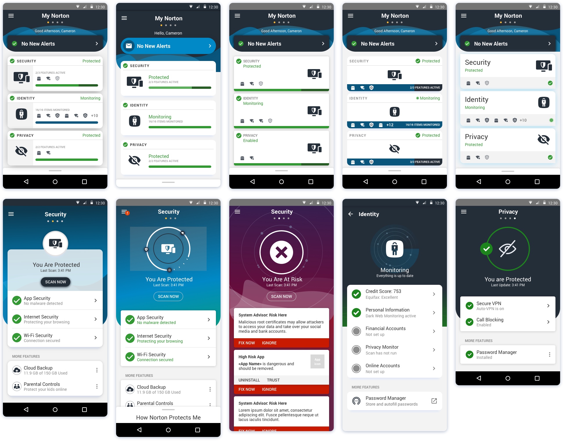
Final Design
After setting the stage for the final look and feel and getting buy-in from our UX leadership, I set a design standard for our team to abide by. I was able to develop the Norton 360 app style in the main UI, scan, Security, and other areas in order allow my designers to apply the styles in our Identity and Privacy areas. Additionally, I worked with our interaction designer to carry out the vision for an app that felt alive as she worked to bring the app to life with animations and transitions. It was important to tap into the psychology of users by creating a design that feels alive with looping animations of waveforms/unique feature graphics and sleek transitions—this gives customers the sense that their protection is always active as we check for threats in the background.
PROTOTYPE | DASHBOARD SCAN ANIMATION | FEATURE DASHBOARD
Onboarding Flows & More

CRITICAL FLOWS
A lot of focus was put on the first time setup along with many other use cases. It was important to have users come into the app and discover what needed to be set up while putting a strong emphasis on the setup of their device security so the can secure their phone before entering important personal information in other features.

Develop
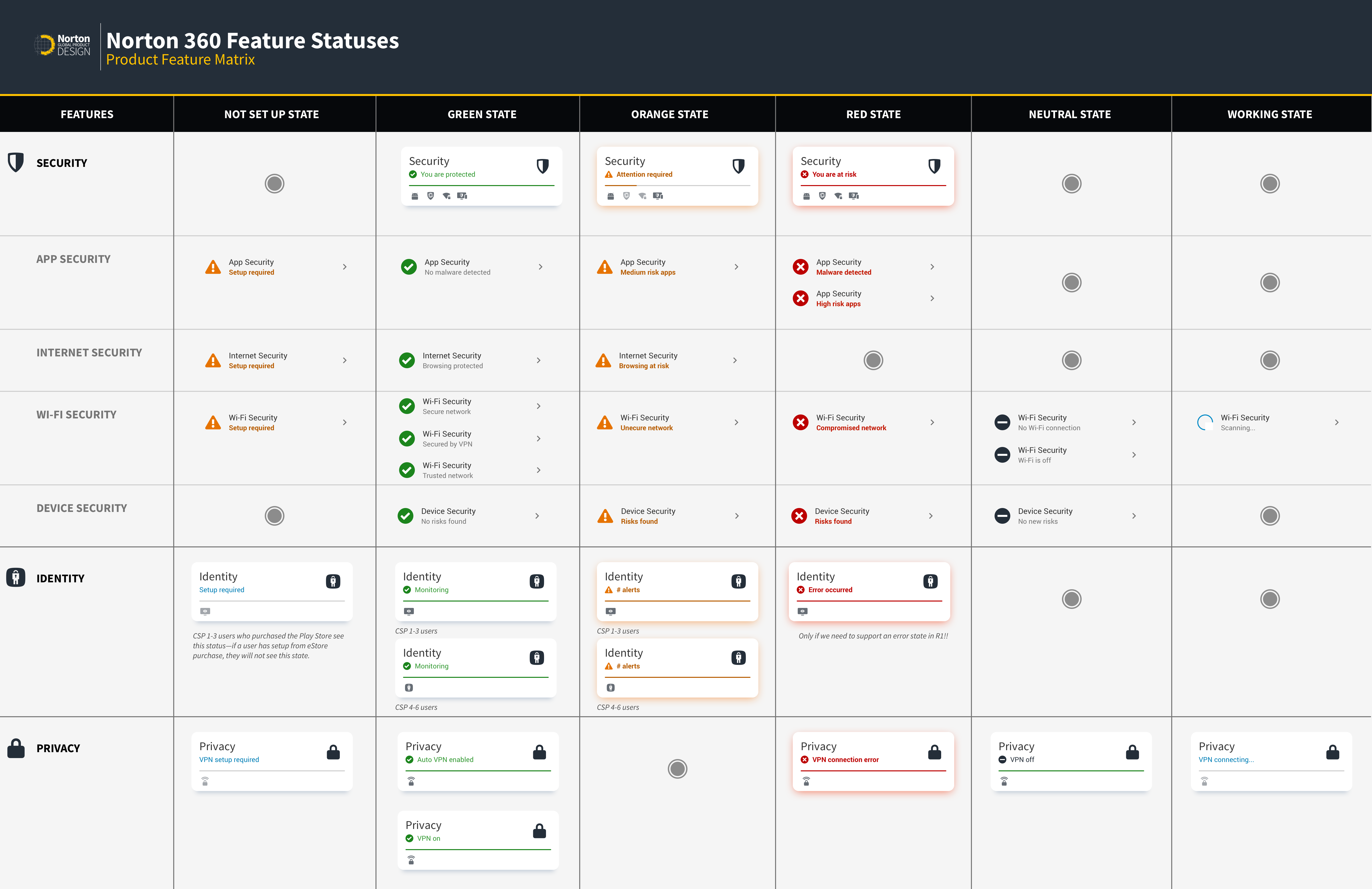
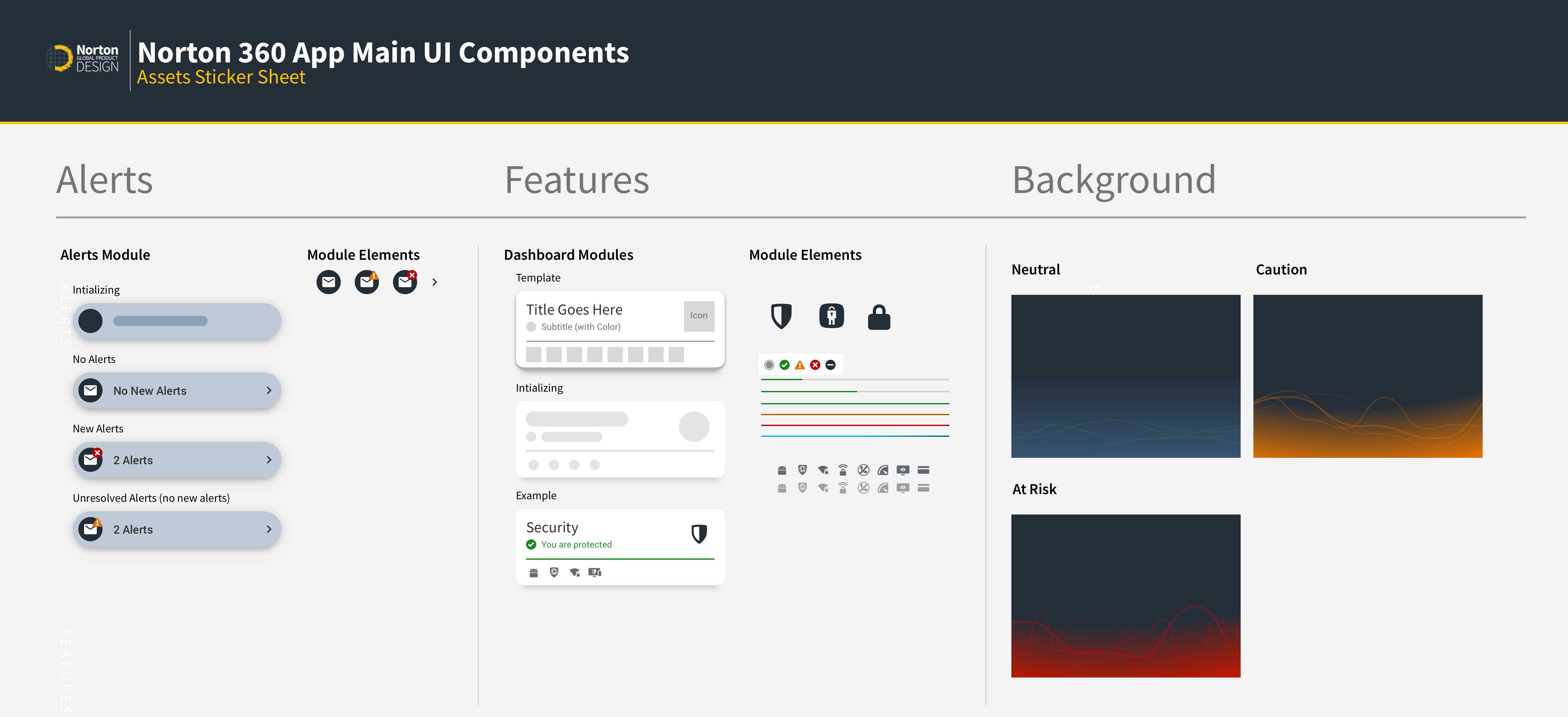
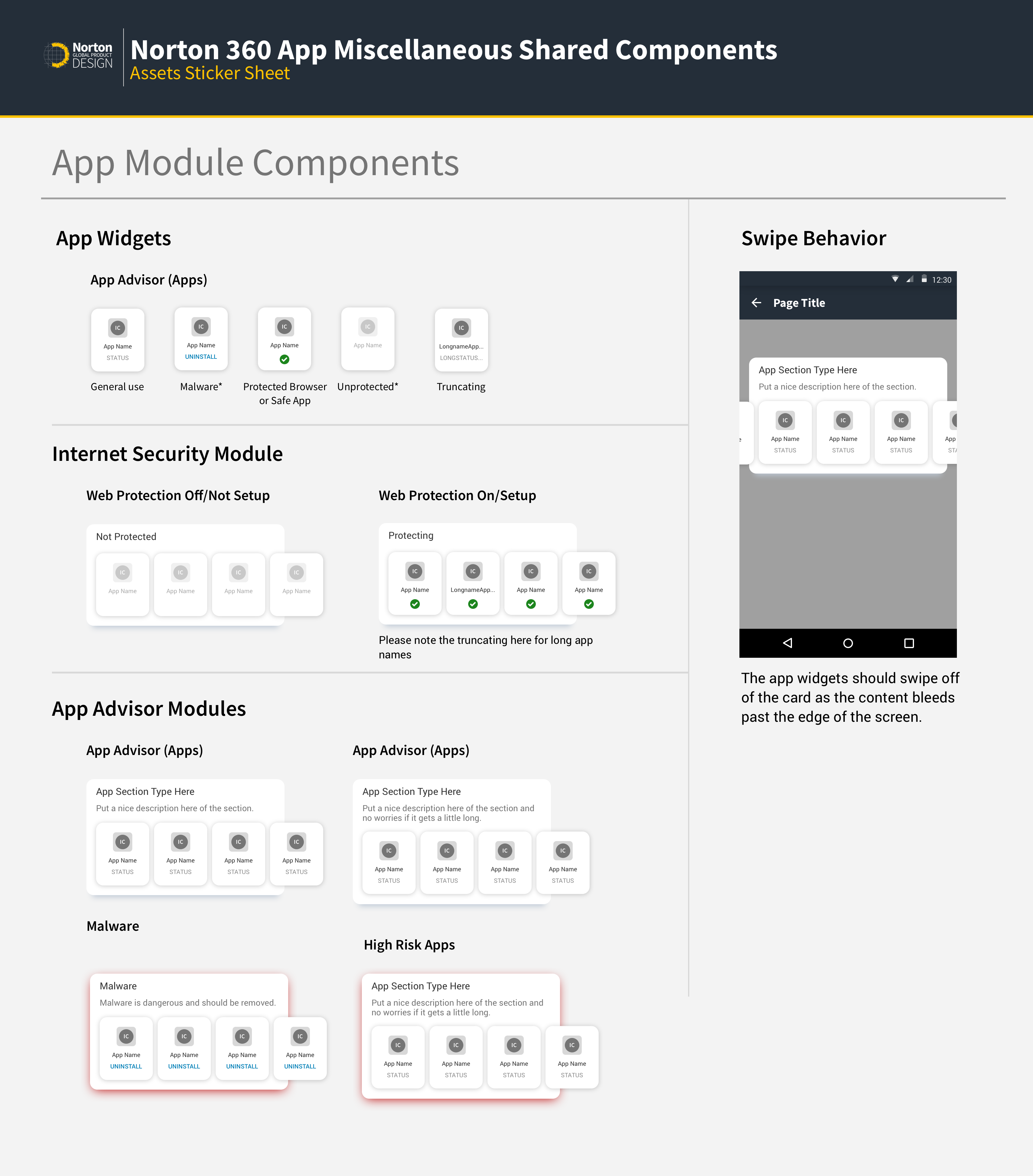
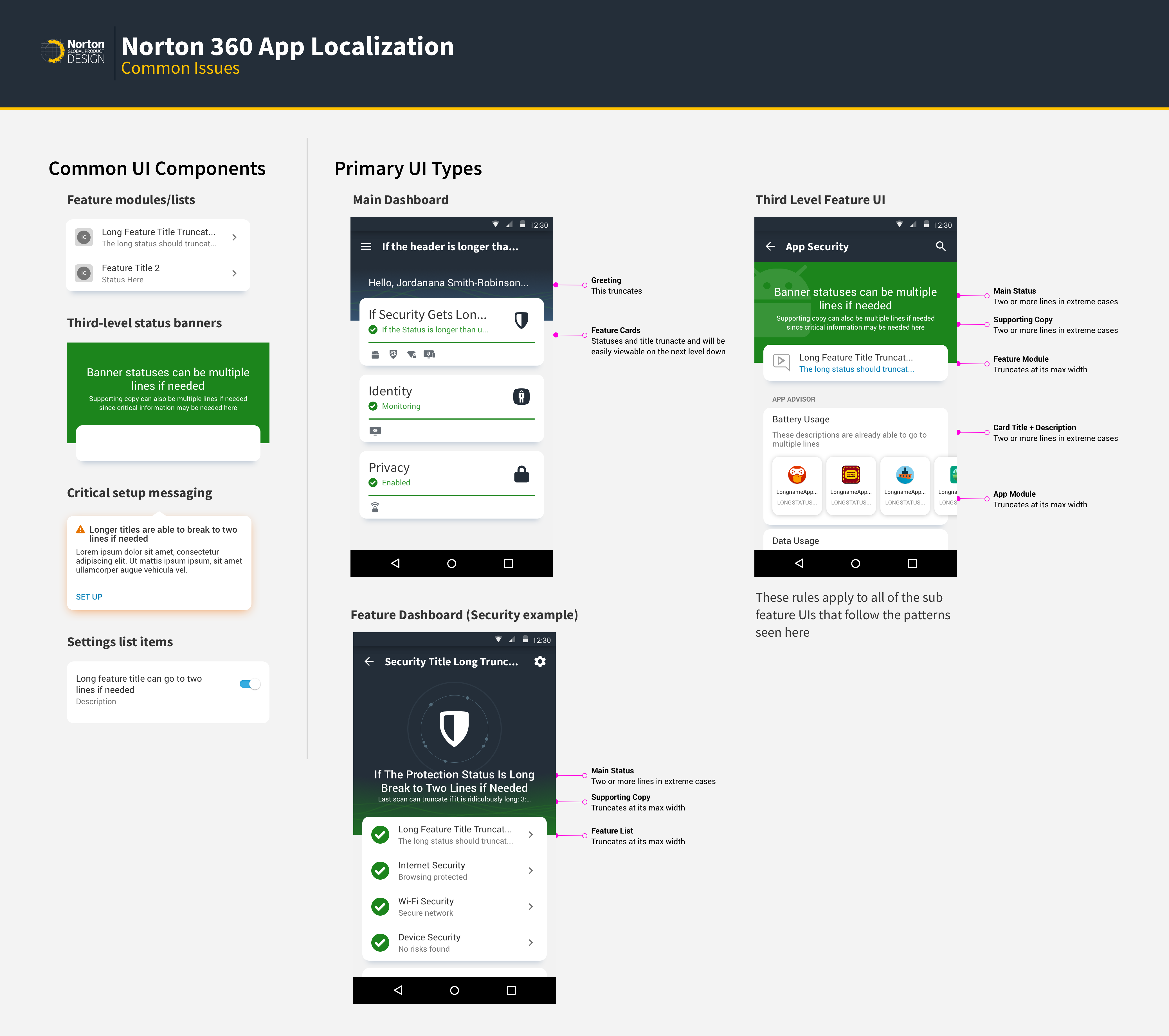
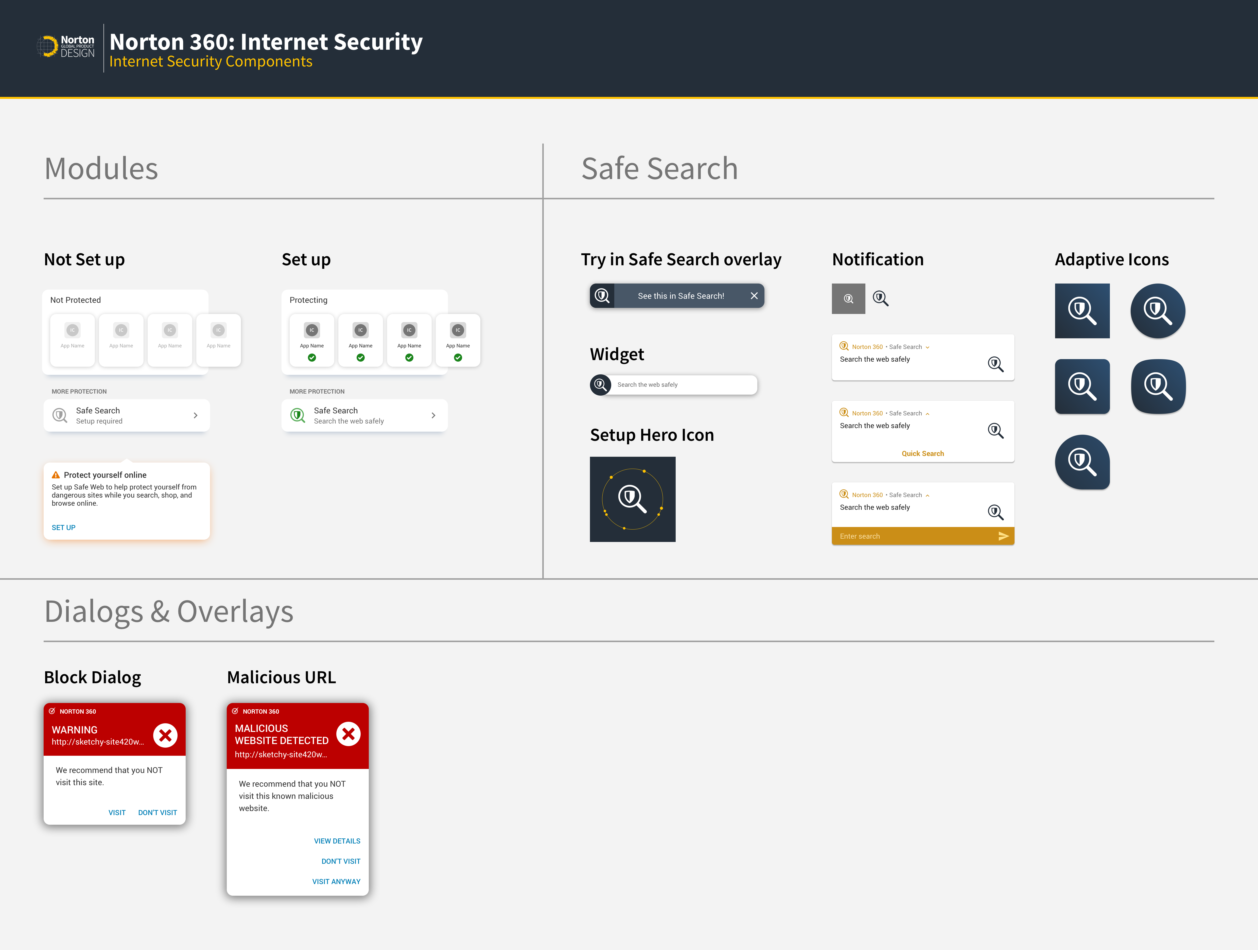
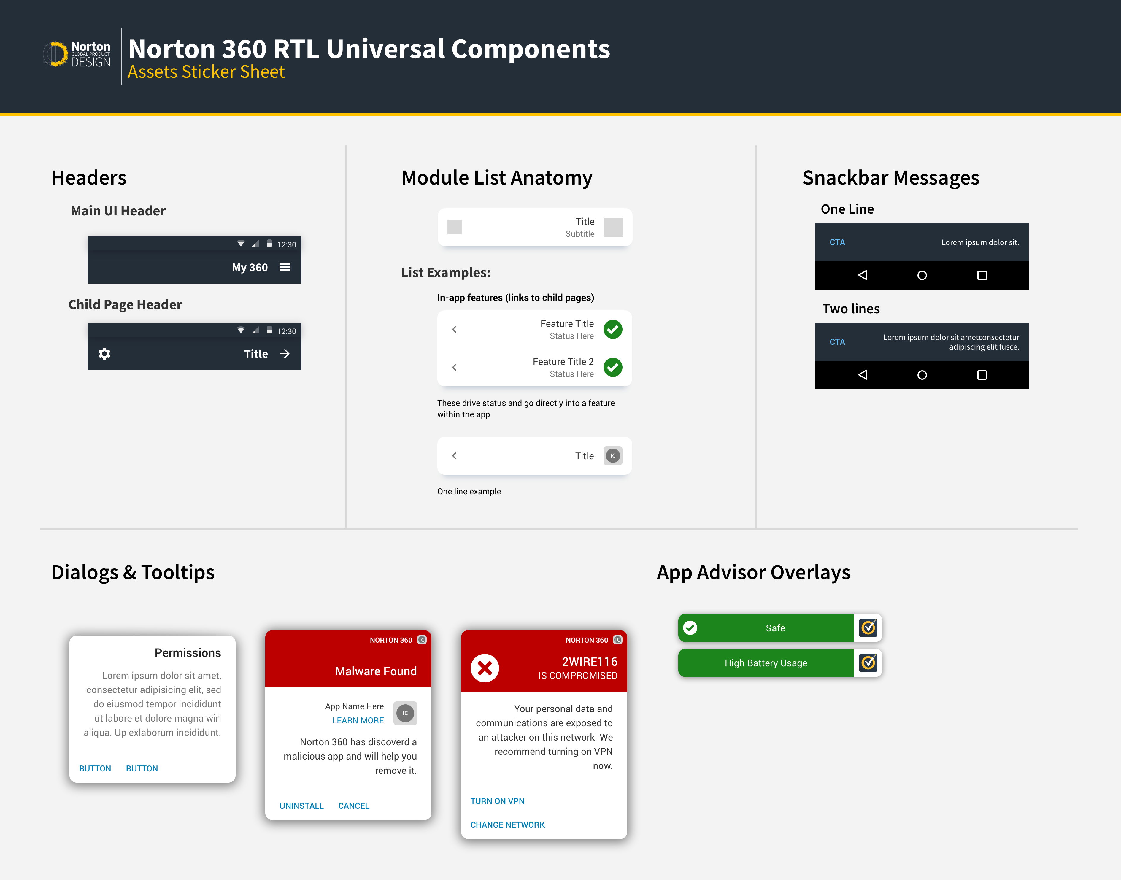
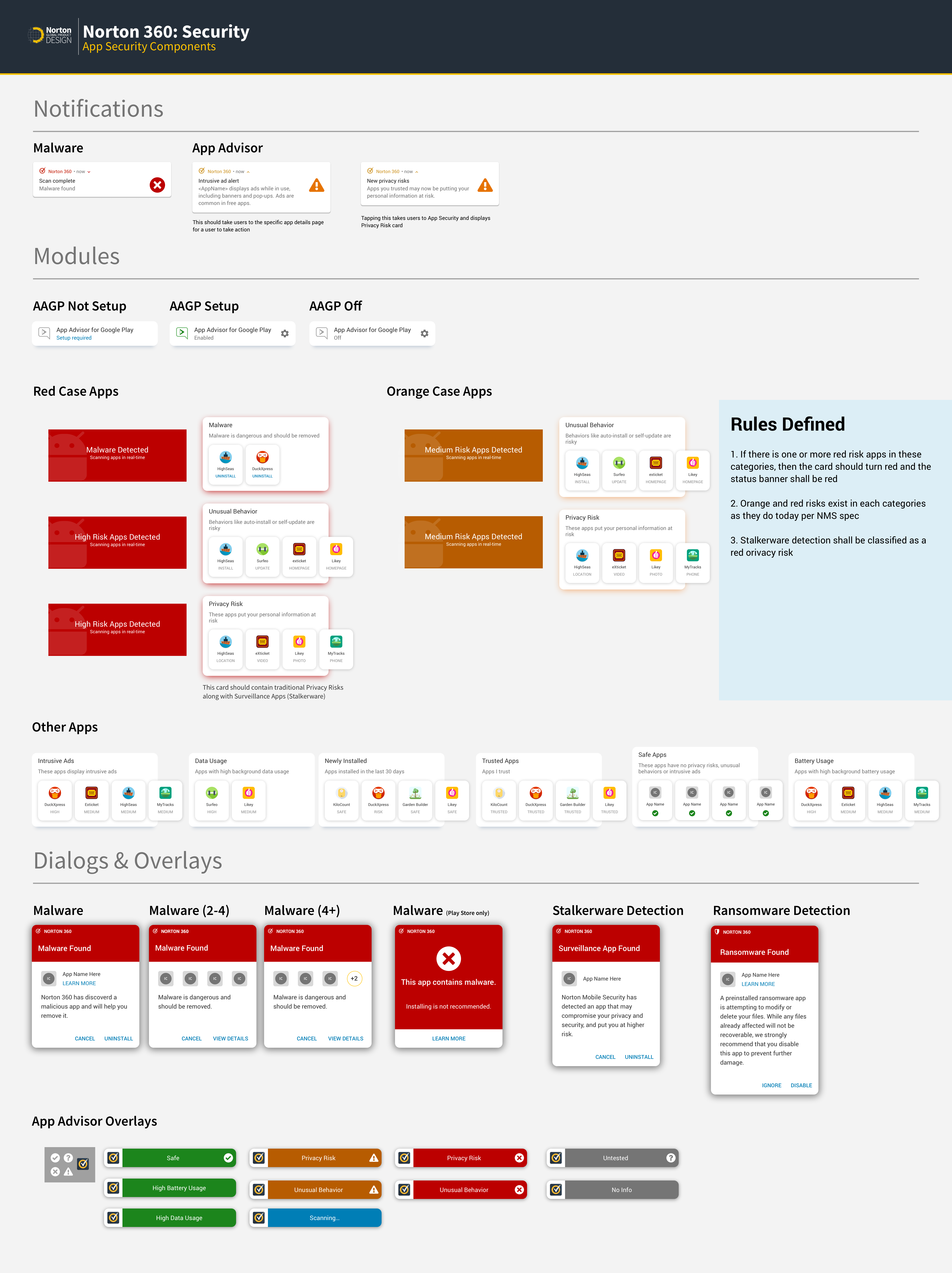
Once the primary design assets were created, it was necessary to create various components sheets for the design team and engineering teams alike. I worked with engineers to define shared components across the app. I also created a design library for other designers to use in this mobile app and other apps. All of these component library sheets were all added to Zeplin/Figma where our engineers consumed all of the specs and assets.
STYLE GUIDE & COMPONENT LIBRARY
Build & Demo Reviews
As the product UX owner, I participated in the bi-weekly demo reviews for the app. I also installed app builds on a mobile phone to check for defects that may not have been caught—I compiled an extensive list and coordinated with a variety of engineering teams to ensure that the defects were filed, fixed, and the app was updated to Norton design standards.
.
Deploy
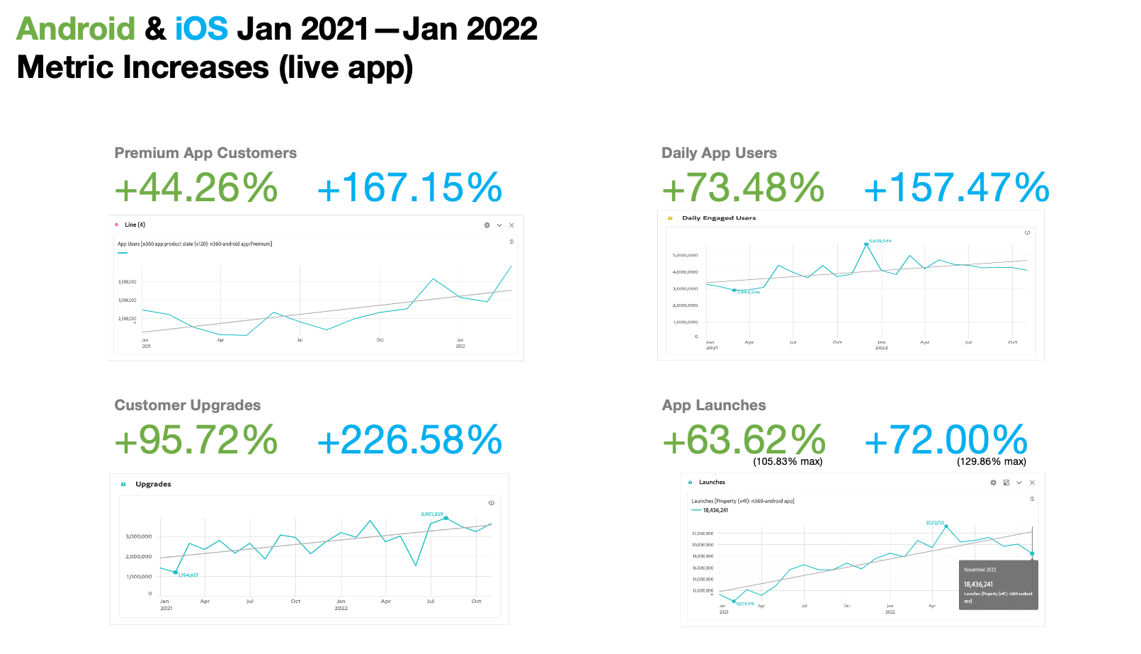
This part of the process is always ongoing after an app launches. An app is never perfect and that is why I leverage our analytics to get telemetry data, customer reviews and other feedback to help improve the experience.
Key Metrics
Some key factors in measuring the success of this new comprehensive app experience Include:
- Number of new customers acquired through App Store and Google Play
- Amount of features set up for active protection
- Customer satisfaction with their ease of use with core features of their subscription in one app vs. three+
- Trial to paid conversion rates for customers purchasing higher tier SKUs on mobile
- Feature setup rates
Conclusion
REFLECTION
Creating an end-to-end experience like this is a very extensive and rewarding experience. Being able to create an integrated experience that has never been done before in the company is a challenging process, especially when the legacies of the three pillar features are essentially from different companies originally. Starting with the basics is key for an undertaking like this and ensuring that you have clarity throughout the design is important with such a large set of features. I think it is important to know what is absolutely needed first from a build perspective for an MVP product. As the product lead, I created the architecture and design for every critical area first and ensured that I could update each of the third level UIs as I moved along in the engineering process—you need to build the frame and plan for the house before you try to build the living room.
NEXT STEPS
Next, it is good to collect feedback and telemetry from users in order to identify pain points in the live product. There are also ideas to increase engagement through customer-focused updates and useful report/scan/news/tour information that would be the nice to haves, but certainly would have increased the scope for an MVP product. But, my mindset is that there is never a perfect product, but rather a product that can be made more perfect through data driven iteration and discovery.
